Project type:
Emotional design school project
Mentored by:
Tanel Kärp
Sigmund Abou Chrouch
Jonathan Galea
Year:
2024
My responsibilities:
desk research
analysis of the app
redesign concept development and implementation
Injecting enthusiasm in a food app
The Project
Why ResQ Club?
I created a redesign for a food app called ResQ Club. My design decisions were based on Don Norman’s three levels of design - visceral, behavioural and reflective.
My reason for choosing to work on ResQ Club was my own personal experience with it. The app had been on my home screen for ages, but I never used it even though their mission to reduce food waste resonates with me deeply.
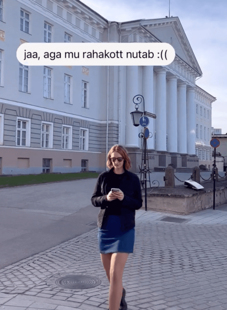
Taking a deeper dive into the experience the app offers, I noticed that the strongest emphasis is on not impacting food waste but saving money.
I wanted to take another look to understand the business objectives, their message and the experience they are offering.
Just another food app
My approach to this project was a combination of analysing the ResQ Club’s brand communication, tone of voice and narratives and observing my own behaviour and user journey in using the app.
This revealed a mismatch within their brand communication strategy and the actual user experience. Reducing food waste is the key message of the brand - this creates a strong connotation with an environmentally conscious user group. At the same time, their social media narratives jump between focusing on sustainability and emphasizing affordability and convenience. Understandably, stressing sustainability too much can alienate users who don’t strongly relate to these ideas and practices, but over-emphasising the affordability and convenience makes this just another food app among many.
Mapping improvement points in the user experience
The visceral level
The behavioural level
The reflective level
My personal take-away
Back
In this project, I deliberately concentrated on dialling up specific emotions to elevate the app to being more than “just another food app”. Acknowledging the user by making their impact visible on both personal and wider levels can be a way to drive engagement, however, this improvement is cosmetic if the brand strategy is not approached holistically. If I was to do this project all over again, I would spend more time analysing the vendors who are present on the app in Estonia and compare it against other markets to get more insights on how these drive brand perception. This would also help uncover how food waste and proactively taking steps to tackle it are seen in Estonia. Including these insights would bring more clarity to the current situation and lead to making better design decisions with both the vendors and users in mind.
The design principles and key emotions addressed in the redesign
1
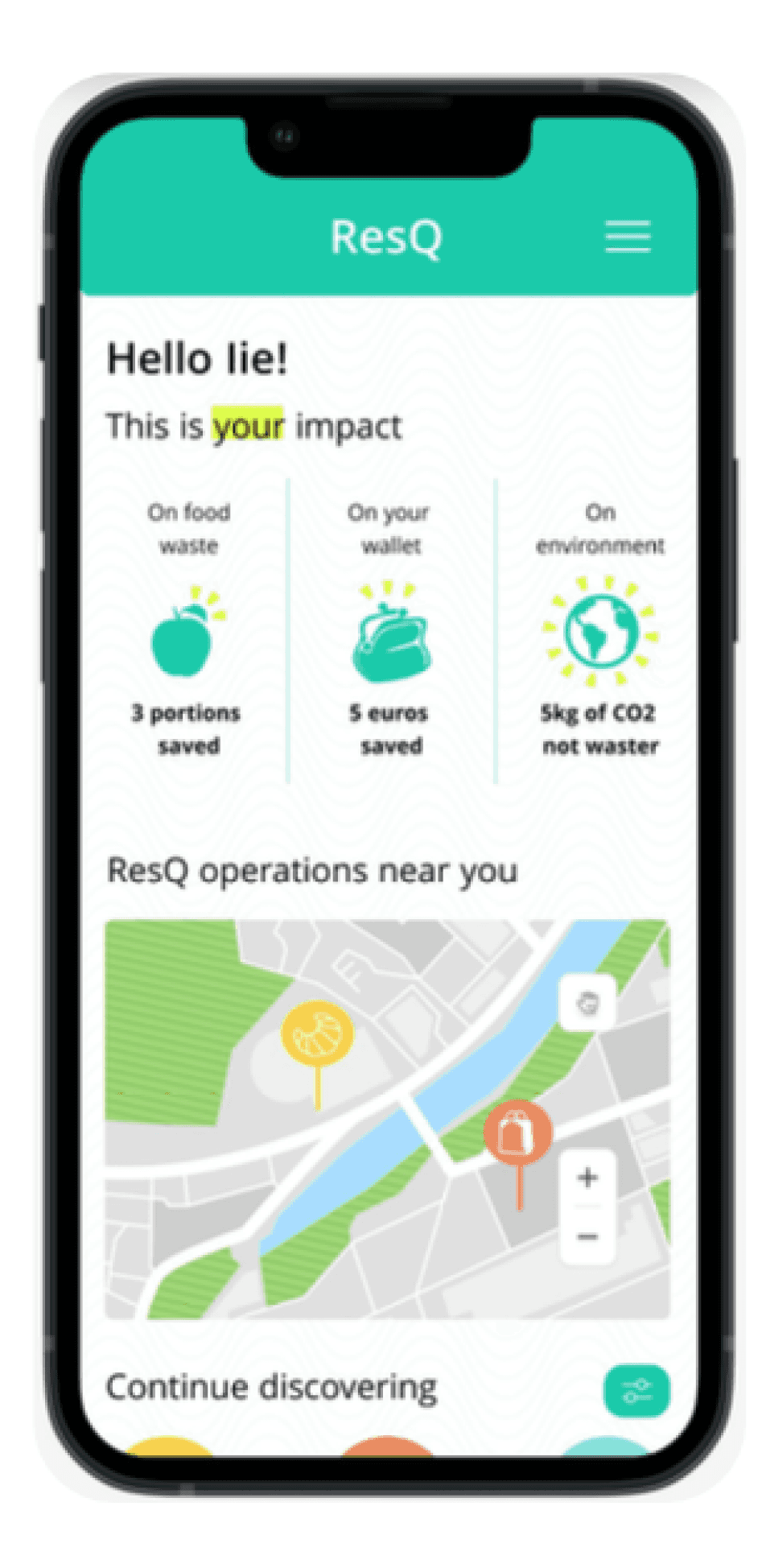
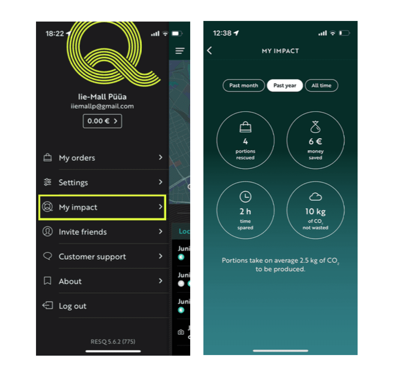
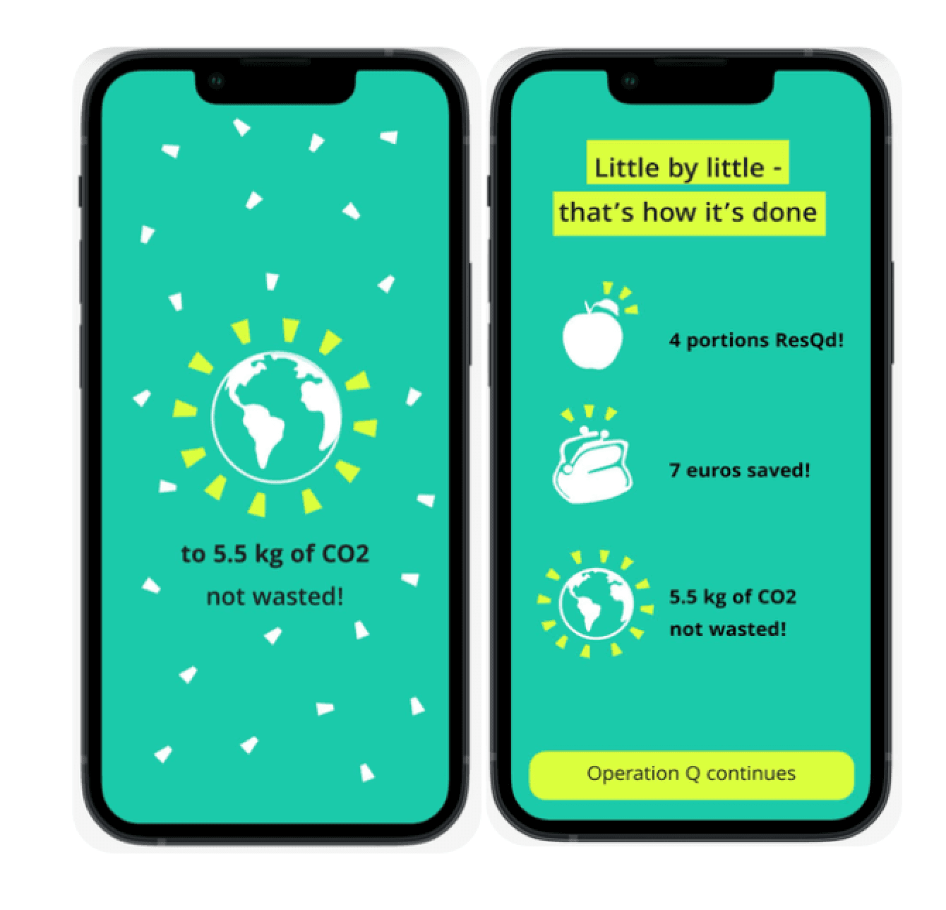
Make the users’ impact visible - dial up the sense of accomplishment
2
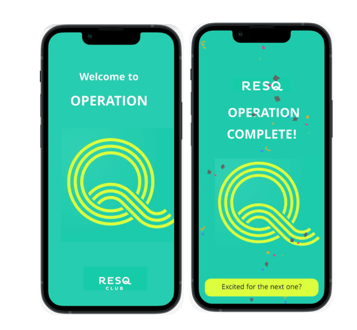
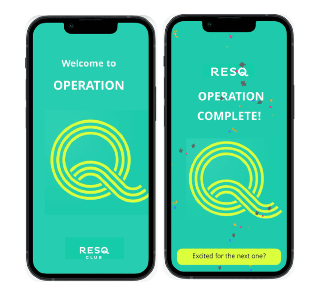
Make it exciting -
like a special operation
3
Use language that injects enthusiasm
This level of design refers to the appearance and the perceptible qualities of the object and how they make the user/observer feel.
Often referred to as usability, but this includes the practical and functional aspects of a product.
This level represents the conscious thought layer, where design is approached consciously to judge how it relates to us on an emotional level.
The problem
The problem
The problem
The solution
The solution
The solution
Sense of accomplishment
Excitement
Enthusiasm
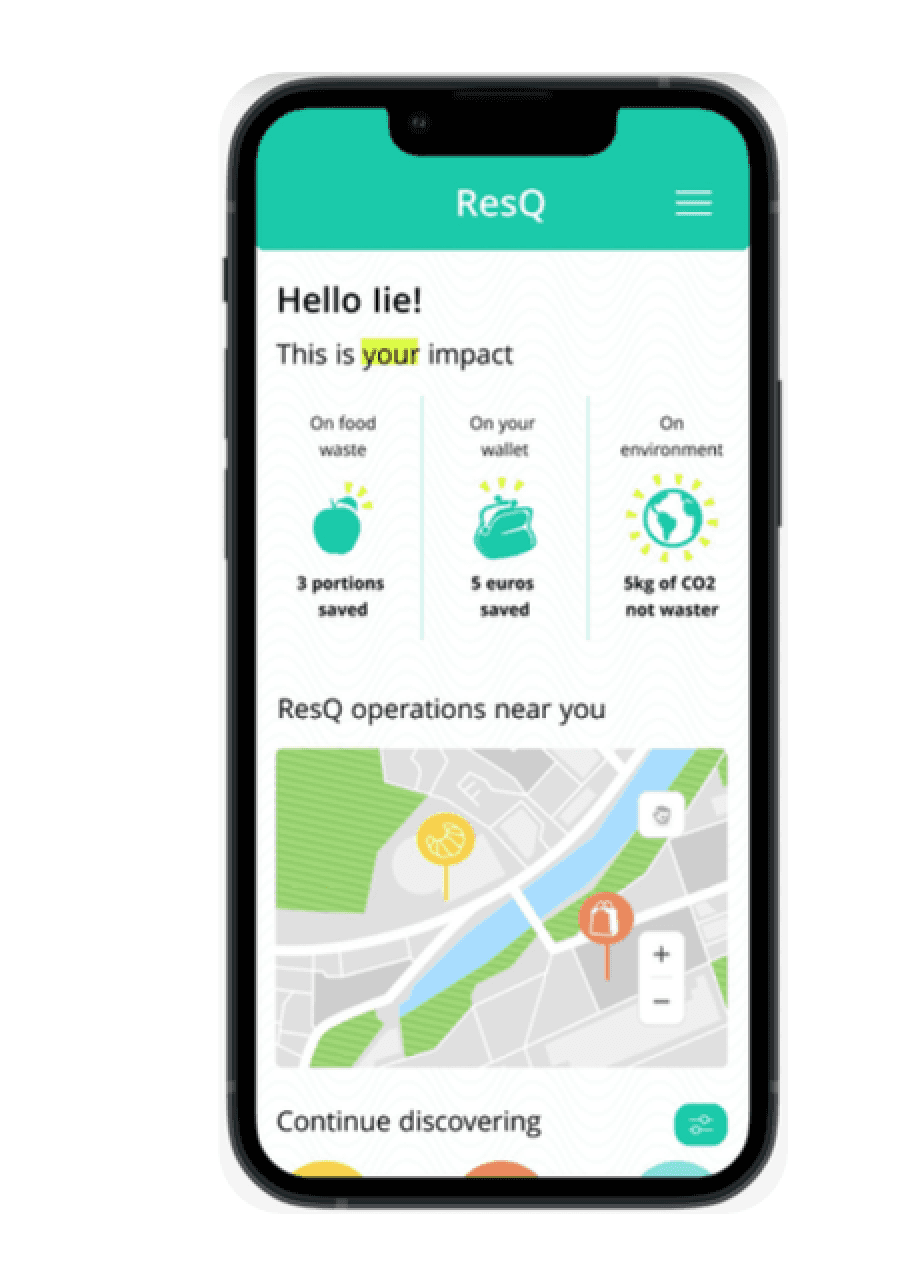
Home screen displays the user’s impact with organic icons to appeal to their sense of accomplishment.
Using the brands’ key colors and adding more organic icons, animations for a more visually stimulating experience.
The app still performs it’s core function, however it does it by inviting the user to participate on a special operation and stepping into a dialogue with them. The user is not just adding discount items to the cart, but actively engaging in an exciting rescue operation.
Treating each interaction as a special operation drives continuous engagement. Visualizing the user’s impact and using enthusiastic and encouraging tone of voice to excite and celebrate the user creates a connection with the app and its mission and functionality.
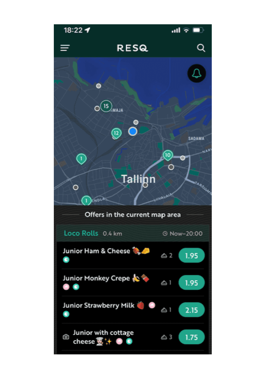
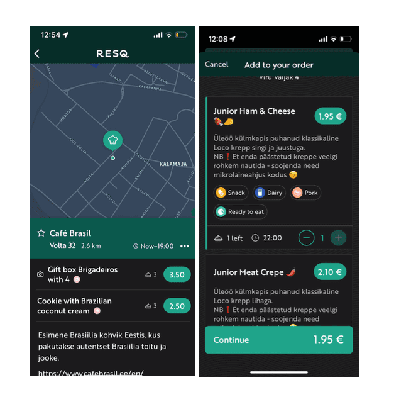
Home screen throws a double punch by disorienting and overwhelming the user with a map and item list.
The look, feel and the language resembles Wolt and Bolt food. Its key concept is not coming through in the interface or the experience. It’s cheap but not cheerful/exciting.
Reducing waste is key to the concept but location of these stats is not obvious. This doesn’t add to a sense of accomplishment.


Narratives of affordability vs narratives of environmentalism on ResQ Club’s social media